If you’re planning on decorating your home then here are my highlights of the latest colours that are fashionable and also look amazing in any room: First Light, Brooklyn Blue, Local Green
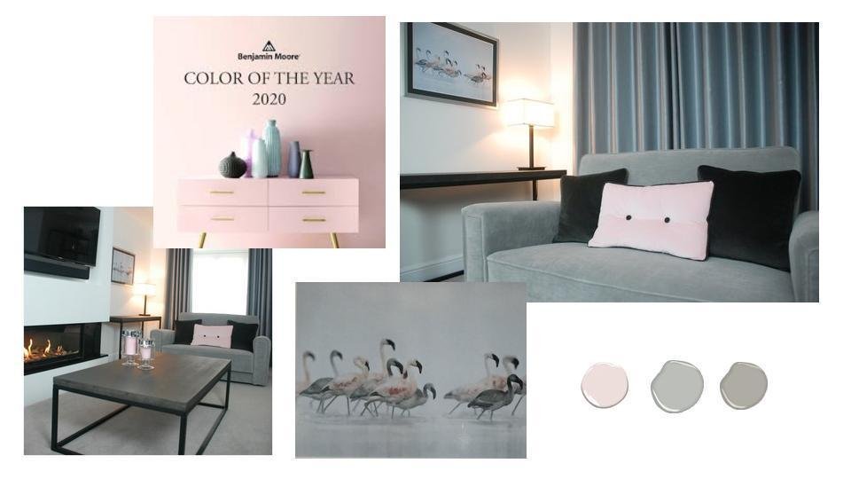
First Light is a soft pink tone that’s popular for accessories and feature walls. It’s a subtle colour that’s easy to live with and looks amazing as an accent in your master bedroom (bedding), office (wall paint) or living room (cushions).
I incorporated a subtle pink colour into my own living room when my husband started calling it ‘Dad’s Den’. I wanted to remind him that the room isn’t just for the boys. My living room has a blend of grey tones and textures that are accented with buttoned blush pink cushions and flamingo pictures. It’s a calming space to relax and always feels luxurious.

Brooklyn Blue looks lovely with all of your neutrals tones and golden highlights. It’s slightly softer than the denim inky blues of previous years but still provides a dramatic feature in a living room or bedroom. If you’re colour shy then you could use it sparingly in roman blinds or table lamps. It looks stylish in a modern apartment or a period home.
I’ve recently incorporated this colour into a stylish kitchen design, for a period London home, to add interest to a large open space. Once my design is completed with a patterned roman blind and a sumptuous dining table with soft comfy chairs, it’s going to feel homely and welcoming. It will be the perfect family space to entertain friends and enjoy precious time with family.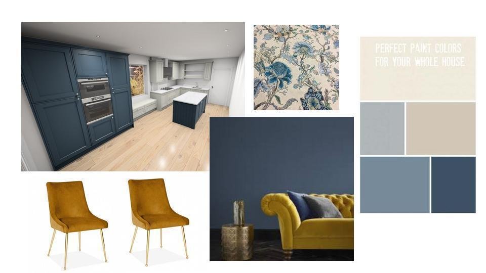
Local Green is my third colour choice because it’s so versatile. It’s lush and organic, depicting nature and growth. During times of uncertainty it’s useful to have this colour blended into your home because it creates an oasis of calm. As well as local green as a paint, you could also balance your home with green plants that feel tactile, look great and smell wonderful.
Here’s my family bathroom that I’ve recently transformed. It has a lift of colour with green highlights and I first bought the cactus by the window when I started work many years ago. The plant still looks amazing and is a piece of art as well as adding a natural element to the monochromatic colour scheme. 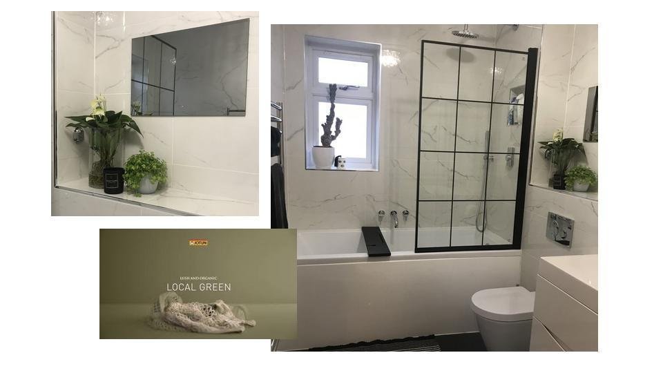
These three colour trends can be used separately (monochromatic colour scheme) or together: blue and green (cool colour scheme), pink and green (contrasting colour scheme), blue, pink and green (primary colour scheme). To learn more about colour balance and how to choose the right colours for you home, checkout MY COLOUR VIDEO:
Top Interior Design Tip For Using The Colour Wheel To
Create Successful Colour Scheme In Your Home
If you’re not confident with colour or you’re struggling to find your perfect shade then just get in touch. I’ll help you choose a colour that suits your personality and makes the room look amazing. I can give your home a boost and instantly re-energise your drab and dreary space with a pop of colour.
Let’s have a chat about colour
Gwendoline
BIID Interior Designer
Recent Comments