to brighten your home
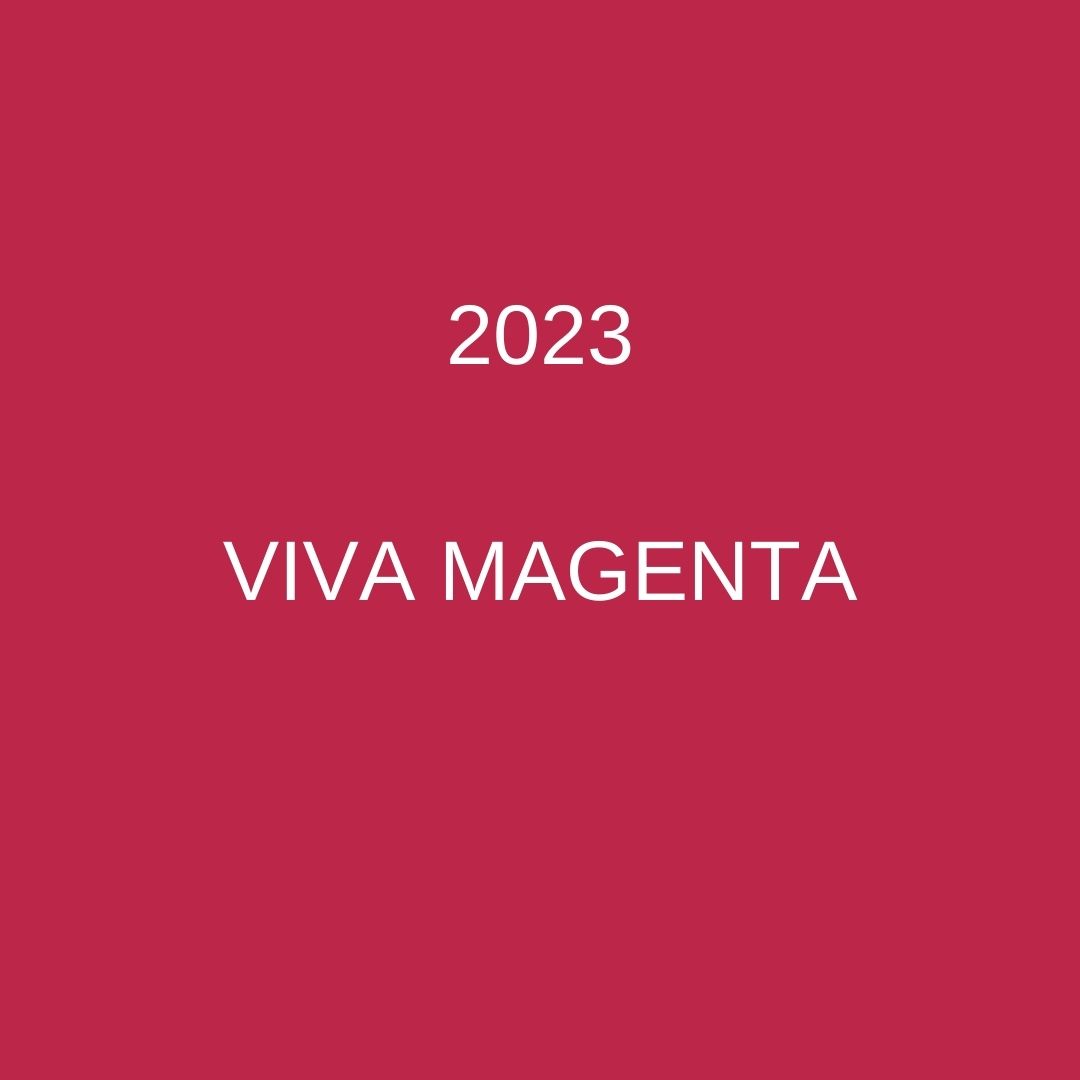
A new year always brings a fresh and exciting colour trend from leading expert Pantone. This year they’ve chosen VIVA MAGENTA, an empowering red, ‘encouraging experimentation and self-expression without restraint’. Much in the spirit of the gorgeous and recently departed Vivienne Westwood.
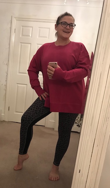
My children bought me an exercise top in Viva Magenta for my recent birthday. It’s a bold, pink-toned red colour that will brighten the dullest of days, BUT will it be popular within interiors?

WILL VIVA MAGENTA BE POPULAR WITHIN INTERIORS?
I’m going against the grain and predicting that this bright colour will NOT be popular within interiors. Why? Now don’t misunderstand because I absolutely do love this colour, particularly in fashion for 2023, but it is a difficult colour for the average person to blend into a colour scheme for their home. I don’t think it will be popular in room schemes, apart from at Christmas time when the red tones are in vogue.
I can say this with confidence because, having tracked colour trends since 2007, most dark and moody colours have bombed within interiors.
- 2008 BLUE IRIS combined the stable and calming aspects of blue with mystical and spiritual qualities of purple. It was as the global recession started to hit, so we were spending less and colours were bold to entice buyers to spend. However, we were used to the calming Duck Egg Blue in our homes so this dominating blue iris was a step too far out of our comfort zone.
- 2013 EMERALD GREEN was full on Irish leprechaun. This was at a time of the introduction for our love of Grey. We were looking for subtle, neutral colours that faded into the background and didn’t cause a ripple in our homes.
- 2015 MARSALA was a rich and muddy chocolate brown. It was too dull for the year it was introduced, but it would be popular now as we’re starting to combine beige tones into our homes.
- 2018 ULTRA VIOLET was seen to be imaginative and inventive, but a little too spiritual and overly dark for most homes.
In 2020, colour within interiors started to take a massive turn with dark inky CLASSIC BLUE making headway. Why? because of the Covid pandemic and lockdown. During this unsettled period, we wanted a home that felt nurturing, safe and calming. The dark blue colour was reassuring and created a womblike feeling. It helped us settle during turbulent times.
Although we’re more accustomed to darker colours, I don’t think Viva Magenta will be popular like the Classic Blue has been. Red is seen as a frivolous colour for romance, or an aggressive colour of anger, but the mood of the country at the moment is unsettled. We want to be nurtured and feel snuggled in comfort, so Viva Magenta is out of line with our emotions.
In my next blog I’ll share the TRENDING PAINT COLOURS FOR 2023 that are perfect for creating a home that feels great and looks amazing. You’ll absolutely love them all.
If you’re modernising your home and don’t want to pick the wrong colour
just phone me for a chat.
I’ve lots of ideas to create your perfect room.
LET’S FIND YOU THE PERFECT COLOUR FOR YOUR ROOM
Gwendoline
BIID Interior Designer & House Dr Consultant
M: 07841 519802
Recent Comments