I loved the Instagram ramblings of JUDI LOVE (@1judilove), expressing her sheer angst of choosing a paint colour.
“How come picking paint has become one of the hardest decisions in my life?
I don’t know how many whites there are, but I’m confused.”
Maybe you’ve experienced this yourself? Like this lady, when you’re confronted with paint colours, it can feel totally overwhelming.
“I still haven’t painted my house 2 years later… literally gave up
after trying to pick a simple beige. Every tester I bought is literally opposite of beige.”
Choosing your perfect paint colour causes so much anxiety. It can feel crushing and deflating when you’re struggling to make a choice… or you choose the wrong colour and have to live it, so you see that mistake every day.
I want you to hear this:
IF YOU’RE STRUGGLING WITH COLOUR, IT’S NOT YOUR FAULT
As Judi said,
“What does an Elephant’s breath look like
that they (Farrow & Ball) can put a colour to this?”
With names like ‘Elephant’s Breath’, paint companies don’t make it easy for you to see how the colour will look in your home. Can you imagine how these colours will look on your walls – ‘Wash Stop’, ‘Creami Colour’ or ‘Wishbone White’? It’s so difficult because you haven’t got an understanding of how the name connects to the actual colour.
That’s why you’re presented with a paint chart with the tiniest sample of each paint colour. And, if you can’t decide from the small swatch of paint, you can buy a sample tin of the paint.
Maybe this has happened to you:
“By the time I’ve tried all the testers, I could’ve bought a 2.5L tin!!”
Why do you still struggle to find your perfect colour when you’ve bought the tester pot, splattered the paint on your wall and you can actually see it in the room? It’s exhausting and deflating when the paint looks so different to how you imagined.
So, where do you start and how do you stop making colour mistakes?
As an interior designer, and colour expert, I have several ways to help you find your perfect paint colour. Firstly, I want you to reframe how you look at paint colours.
- REFRAME HOW YOU LOOK AT PAINT COLOURS
Currently, when you’re choosing a paint colour, it’s usually a singular decision. For example, you want a certain colour so you choose a few samples from your favourite paint company, but they don’t look right in your room. Why is that? It’s because you’re not emotionally connecting to the paint colour, so it’s not right for the room.
I want you to start by thinking of your home as a book, where each room is a chapter of your life:
- Chapter 1 might be your kitchen where you love to entertain friends
- Chapter 2 is the living room to nurture your family
- Chapter 3 could be a practical home office
- Chapter 4 would be the bathroom to energise your mind and body
- Chapter 5 is your bedroom that’s your personal space to relax and unwind
Each space has a different energy so you’re looking for colour tones that enhance your story for each individual chapter. That’s why a white isn’t just a white. Do you want it to feel bright and invigorating or moody and comforting? The colour needs to connect with the emotions you want to create in this chapter of your life.
That’s why a paint colour can feel so wrong, because it’s out of balance with your emotions. Take a moment to write down a couple of words that describe how you’d like your room to feel once it’s finished and looking lovely. When you look at a paint colour, it should correlate to those feelings.
- CREATE YOUR COLOUR SCHEME
The next reason that your paint choice isn’t working is because you’re isolating the paint colour from everything else in your room.
For example, in every chapter of a book, you need different elements to balance the story, whilst keeping it exciting. For example, your DÉCOR is the background, FURNITURE is the characters, LIGHTING adds the drama and ACCESSORIES reflect your personality.
If you only focus on a paint colour, the background, then your story will feel unbalanced because you’ve neglected how that paint interacts with and supports everything else in the room. Colour transcends all of these elements as they come together to create an interesting plot, and a page turner, so your room is stimulating and stylish.
Instead of looking at paint as a singular item, think about creating a colour scheme that encompasses the décor, furniture, lighting and accessories. On Pinterest, you could add a colour board for each room, where you can visually see how the elements blend together to create your balanced room that looks gorgeous and feels amazing.
Here’s a simple colour board for one of my clients. You can see how the rust and green colours blend together with natural wood tones and casual styling. When I apply this inspiration to her bedroom, I’m thinking of how this colour scheme feels nurturing and comforting. Follow my FREE Design Digest if you’d like to see future highlights of the finished room.
- TAKE INSPIRATION FROM PATTERNS
If you’re less experienced with colour or you’re struggling to create a successful colour scheme, look for a pattern to inspire you. It might be a feature wallpaper or a fabric for curtains.
You don’t necessarily have to use the pattern, in your room, because you’re just pulling the colour scheme from it. Designers have spent hours creating the colour scheme, so it can be a great inspiration for your room.
This is particularly useful for the lady who hasn’t decorated in 2 years because she can’t find the perfect beige. She could find a pattern that works in her room and then pull the colours out of the fabric/wallpaper to build her colour scheme.
For example, this is Clarke & Clarke ‘Golden Lily’ fabric that I’m using as inspiration for my seaside house, The Croft.
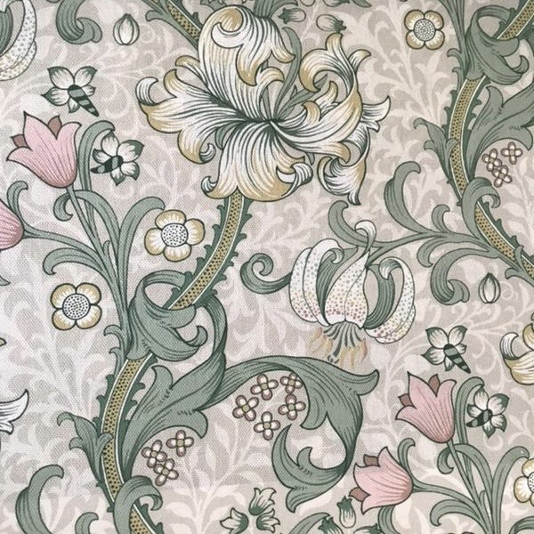
When you mention the word seaside, you might expect a typical blue and cream colour scheme, however this is an Arts & Crafts house that already has a traditional green kitchen.
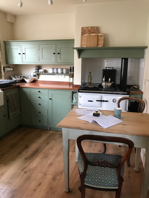
The green, in the fabric, blends beautifully with the kitchen units. I purchased the chairs from the previous owners of The Croft,, and here’s how they’ve been recovered in the fabric.
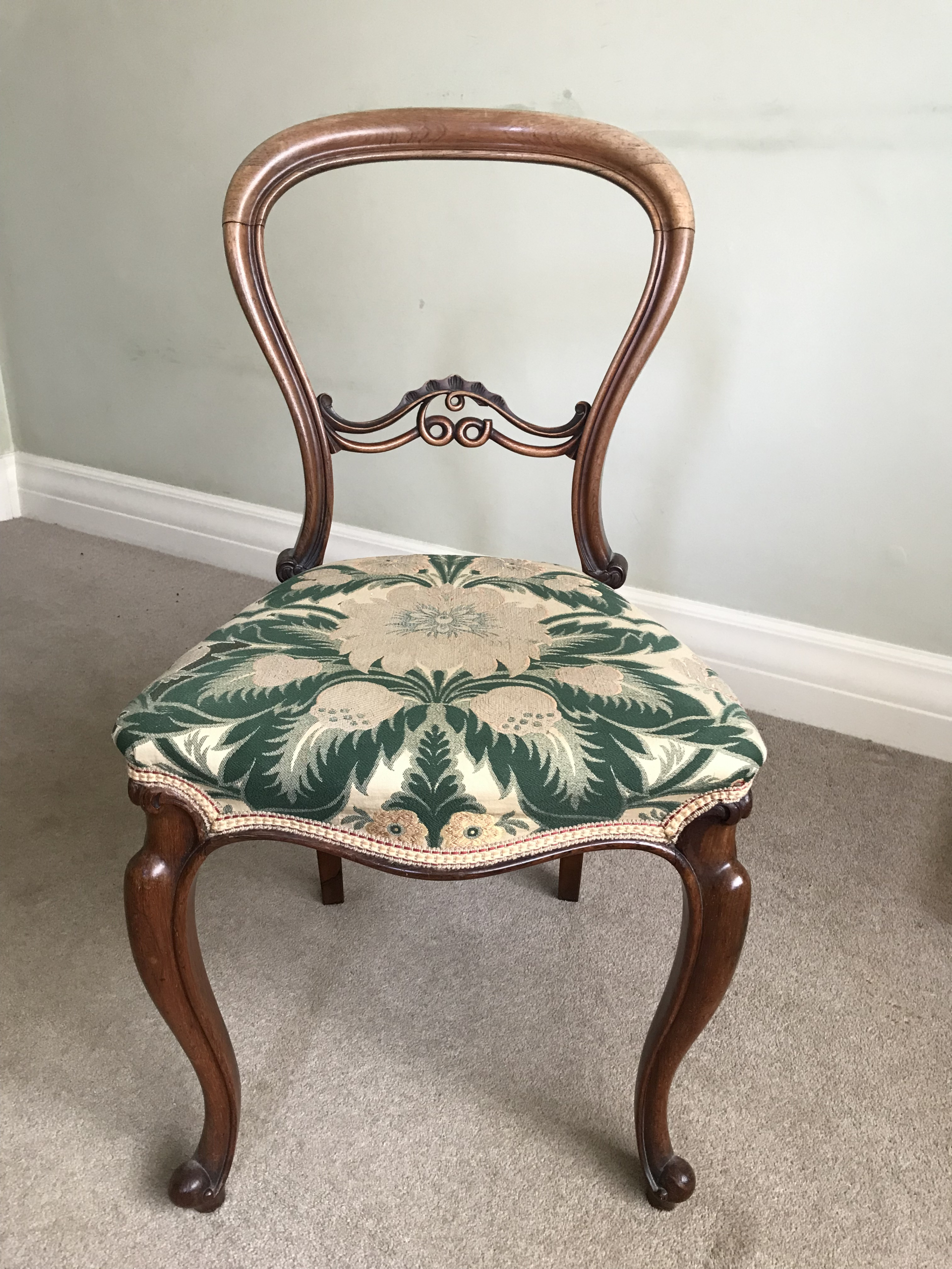
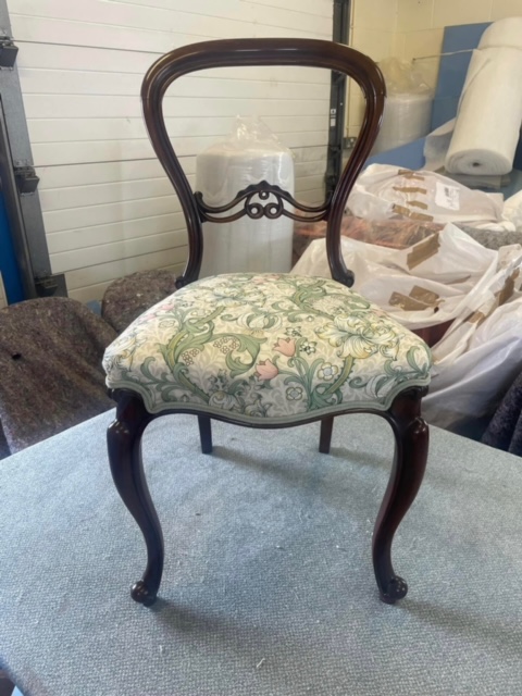
Can you see how the new ‘Golden Lily’ fabric adds a modern touch whilst also complementing the period of the chairs? I also changed the trim style, so that it’s less fussy, which helps create a crisp, sleek look.
Instead of starting with a paint colour, I chose the Clarke & Clarke fabric to be my inspiration. Now, it’s so easy to pick out the cream colour from the fabric and match it with a paint.
I’m using Coat paints because they’re environmentally friendly. The paint has a low VOC (toxin) and odour, plus it isn’t tested on animals and it’s Vegan friendly.
I also like it because you don’t get a tester can. Instead, there are tester paint sample patches that stick to your wall like a post-it-note, so there’s no messing about with a paint brush and stocking up sample paint pots.
There have some beautiful colours, and I particularly like MODEST (taupe off-white) with this fabric. The taupe in the fabric balances with the taupe in the paint colour. I’m pulling the green, cream and beige colours out of the fabric to create a colour scheme for the whole of the house.
For ‘The Meadow’ guest bedroom, I’ve chosen the Harlequin fabric ‘Daisy Trellis’ that was designed in collaboration with colour expert Sophie Robinson.
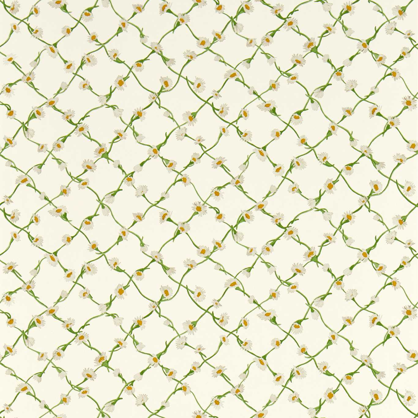
It has a fresh feeling that evokes the nodding daisies and camomile that’s seen growing along the coastline in Suffolk. As this fabric has a milky coloured background, I chose to pick out the green with Coat’s YARD PARTY (Hazy Grey Green) wall paint. This means that I don’t have to exactly match the cream colour to the fabric.
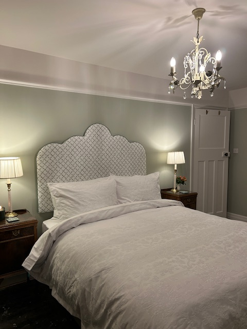
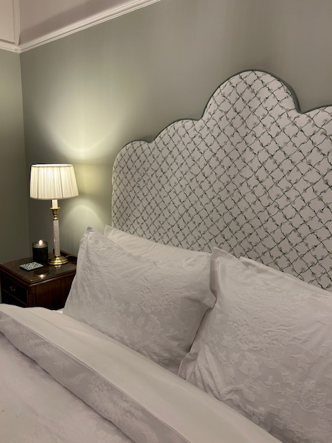
I’ve used Coat MINDFUL (very pale taupe) on the wall above the dado, the woodwork and onto the ceiling. It’s a lovely pale, fresh cream colour. If this paint colour was directly behind the headboard, the colours wouldn’t be perfectly aligned. However, being so high up, the paint looks lovely in the Meadow bedroom.
If you’re struggling with paint colours, follow these interior design techniques to help you wade through the colour charts:
- Think of your home as a book, where every room is a chapter telling the story of your life. What do you want the room to say about you, and how do you want it to feel?
- Create a colour scheme that blends all the elements of your story, ie: Décor, Furniture, Lighting and Accessories
- If you’re struggling, use fabric or wallpaper to help you define a colour scheme
Still feeling overwhelmed and colour is a mine field?
Don’t throw your money at the wall by choosing the wrong paint colour
LET’S CREATE YOUR PERFECT COLOUR SCHEME TODAY

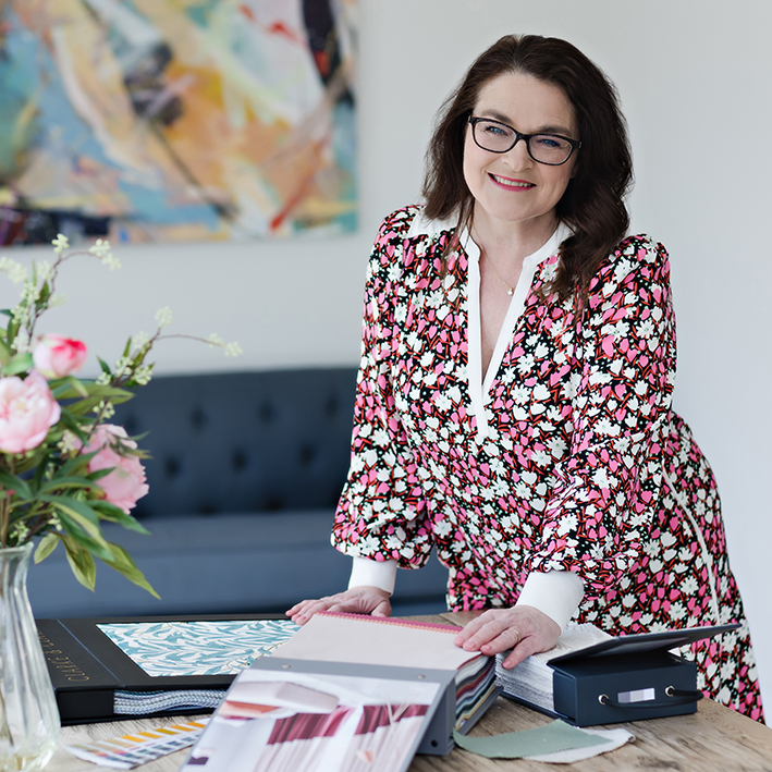
Gwendoline
BIID Interior Designer
Colour Expert
Kitchen Designer
Bathroom Designer
Space Planner
M: 07841 519802
Recent Comments