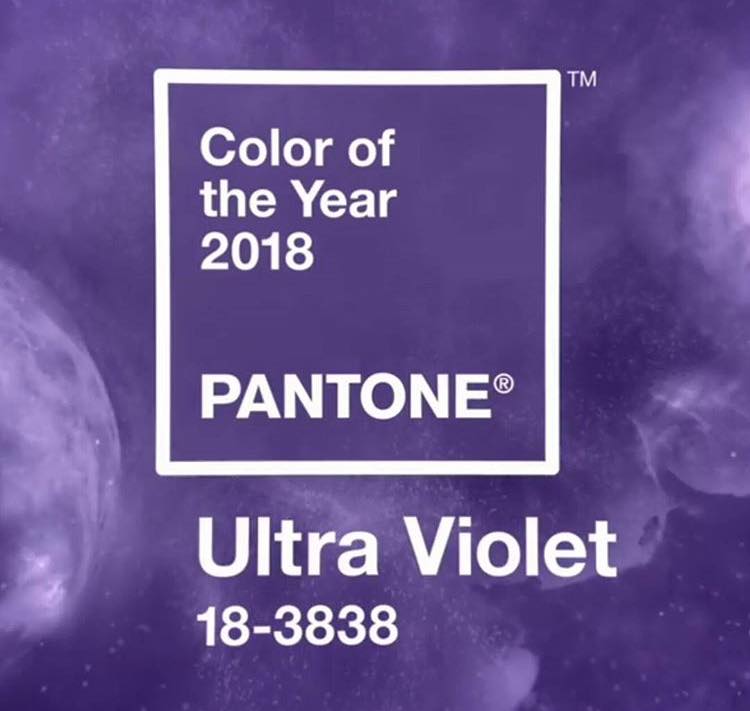
Ultra Violet is the colour expert ‘Pantone’ trending colour for 2018. Pantone’s executive director, Leatrice Eiseman expressing: “We are living in a time that requires inventiveness and imagination. It is this kind of creative inspiration that is indigenous to Pantone 18-3838 Ultra Violet, a blue-based purple that takes our awareness and potential to a higher level.”
Purple is a regal colour that has it’s history in royalty and opulence because the colour dye was very expensive so it was only affordable for the wealthy. Now it’s seen as a status of power and opulence.
In 2008, many of my clients were asking me for a purple master bedroom, enhanced with crystal lights and silk curtains. It was a retreat from the height of the recession, giving a boost to confidence and a feeling of grandeur. 2014 was another year for purple power, with RADIANT ORCHID taking centre stage. This was a blend of the power of purple balanced with nurturing pink. It was highly popular because of it’s calming and elegant qualities.
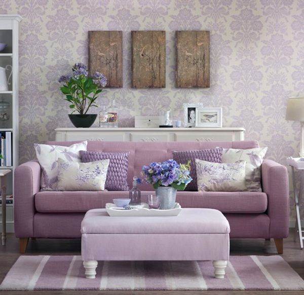
Radiant Orchid was an easy colour to blend into our homes because it was soft and inviting, however, for 2018 with the dark any mysterious ULTRA VIOLET might not be quite so popular within interior design.
Darker colour trends have always struggled within interior design… Chilli Pepper (2007), Emerald Green (2013), and Marsala (2015) were all beautiful colour trends but their depth of colour scared off the average homeowner.
Ultra Violet could be another colour trend like this, where it’s sanctioned to the bedroom and more intimate spaces, but I’d like to show you how I used this colour within the bathroom of a London apartment to create a personal and intimate space for a professional couple.
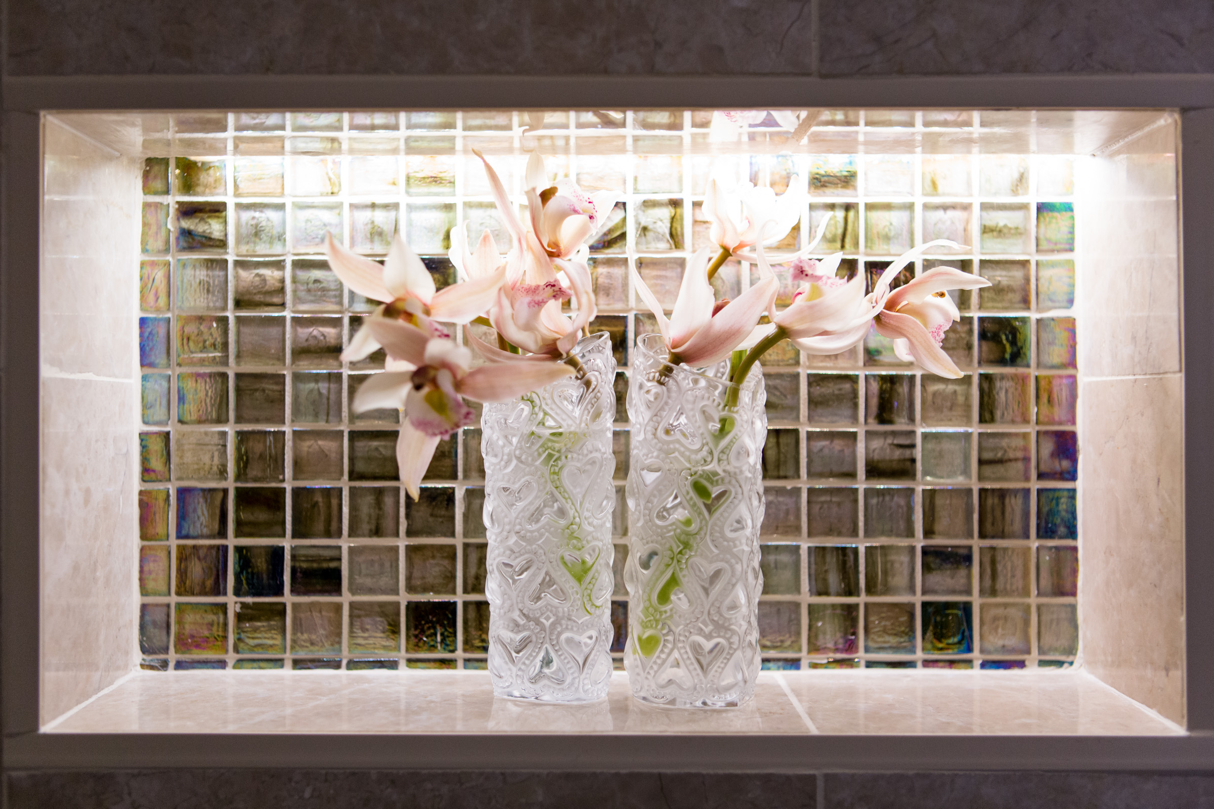
The feature wall of iridescent purple and green mosaic tiles change colour with the light, creating a wall of interest that’s invigorating and calming. The green helps to tone down the strength of the purple.
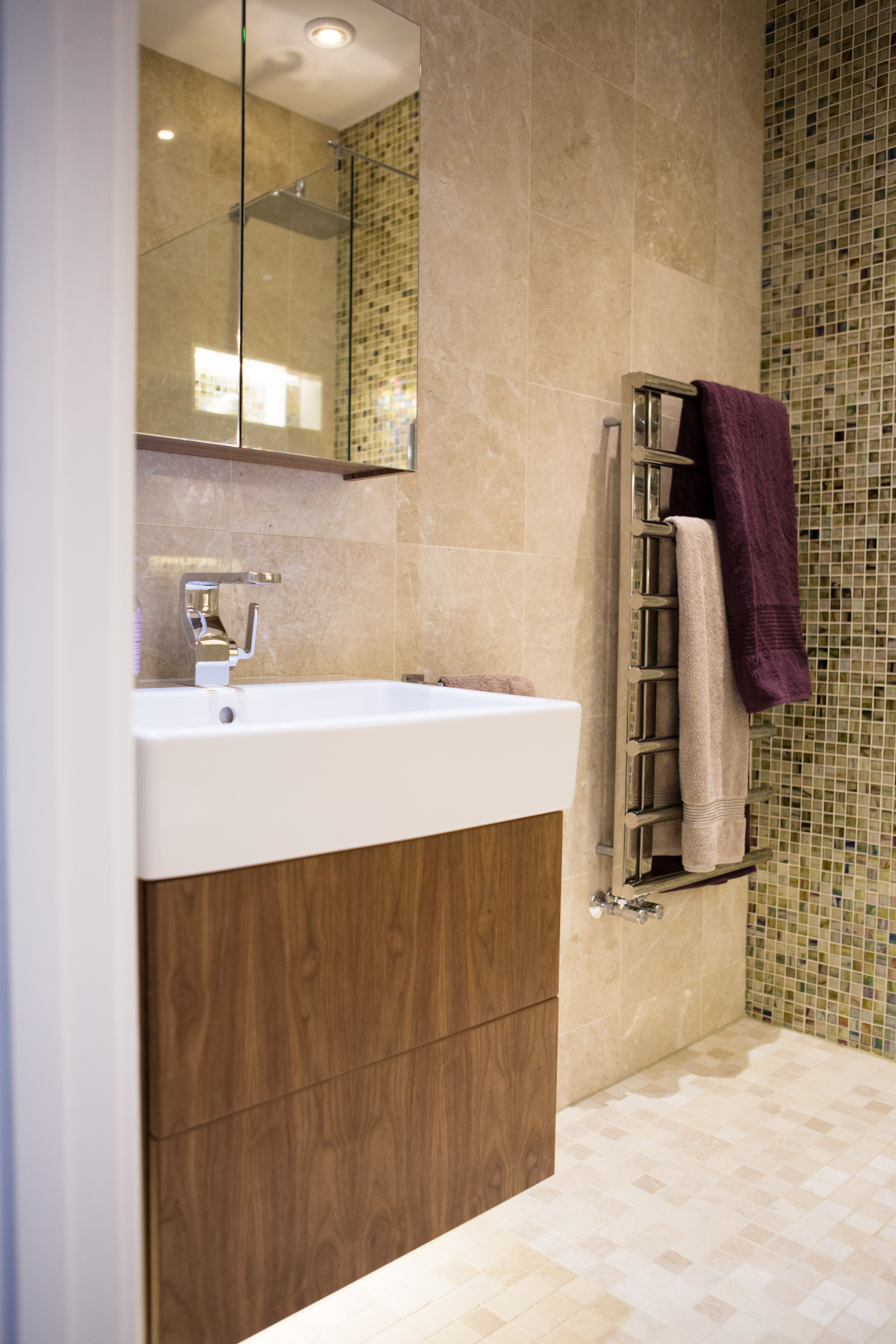
You’ll notice that the feature wall is balanced with neutral marble tiles which also reduce the power of the purple so that the bathroom feels liveable and cosy rather than dominating and overwhelming. This is a top tip for balancing the power of a strong colour. Either calm it down with neutrals or use it sparingly and selectively within the room.
I hope this will give you inspiration to go bold with purple power because it’s not only on trend but also looks elegant and is absolutely #gorgeous.
If you don’t feel confident incorporating bold colours like Ultra Violet into your home, or you’re struggling to find just the right colour for your space, then get in touch and I’ll pop over to find you the perfect colour balance.
HAPPY NEW YEAR

Gwendoline Alderton
M: 07841 519802
Recent Comments